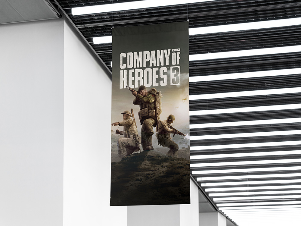
Client
Relic Entertainment
PROJECT SCOPE
Concept Development
Visual Design
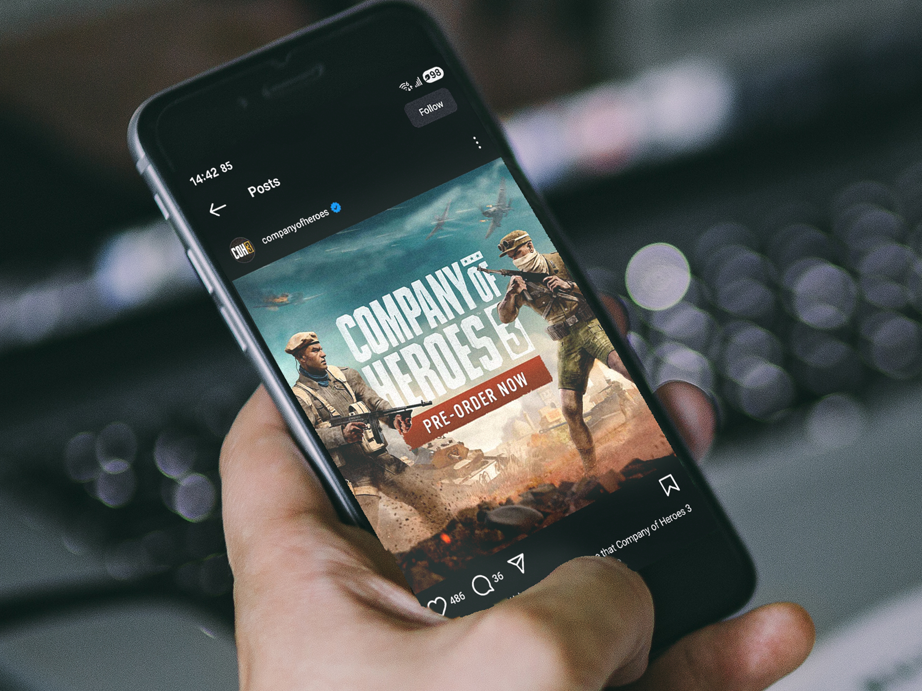
Social Asset Creation
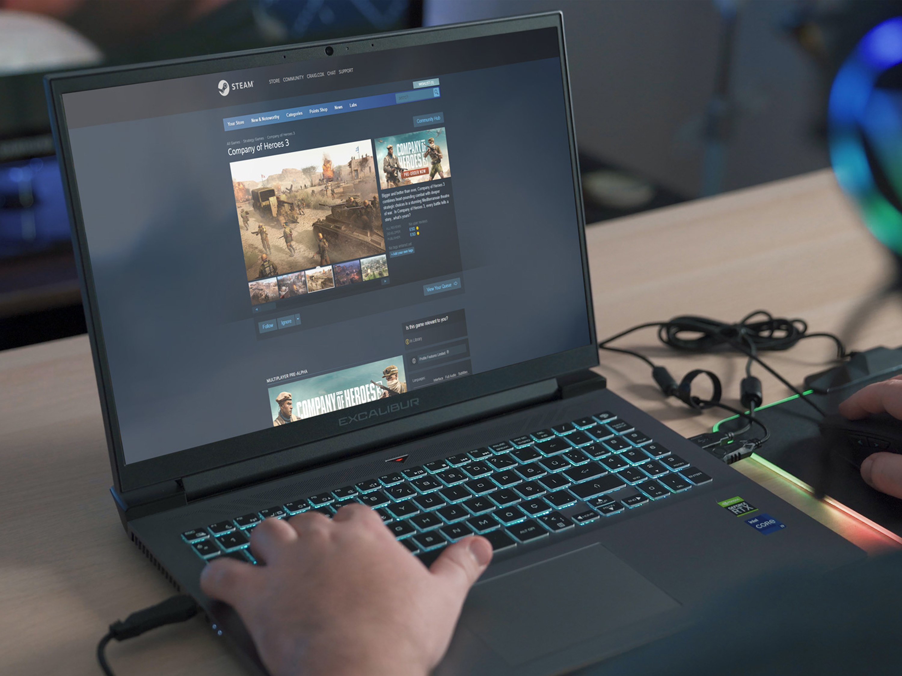
Platform Adaptation
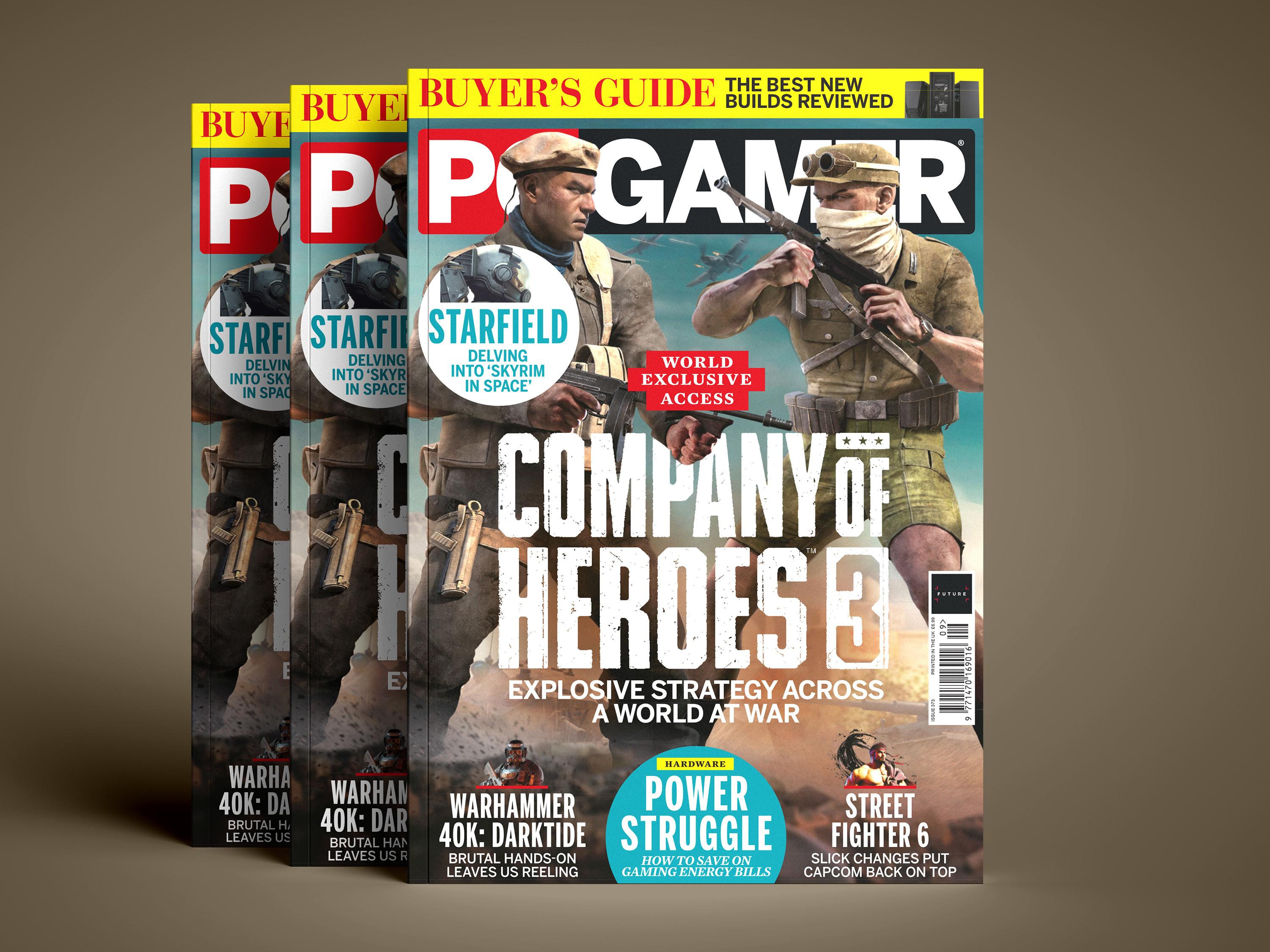
A series of marketing key art pieces was developed to support launch campaigns for Company of Heroes 3, blending striking visuals with historically grounded themes. The work was carried out in collaboration with the game’s art director, marketing team, and external agencies, ensuring every piece aligned with both creative vision and promotional goals.
The core objective was to deliver eye-catching artwork that attracted attention, generated interest, and set the tone by providing a clear glimpse into the game’s core themes, theater, and factions. Given the sensitivity of the genre, the central challenge was ensuring characters were depicted with historical accuracy while avoiding political symbolism. This was achieved through extensive research and careful use of reference materials.
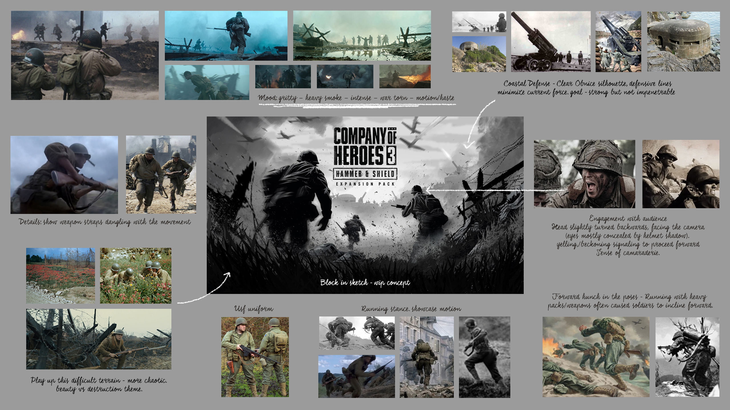
Work encompassed the creation of initial concept sketches and mood boards to establish composition, essential elements, tone, mood, alignment with in-game assets, and historical references. Throughout the project lifecycle, art direction was provided, stakeholder feedback was managed and distilled, and oversight was maintained from inception through to completion.
The outcome was a suite of impactful artworks that elevated the campaigns, aligned seamlessly with brand objectives, and were delivered with attention to detail and quality. In addition, variations and adaptations were produced to strengthen wider marketing efforts across different platforms.
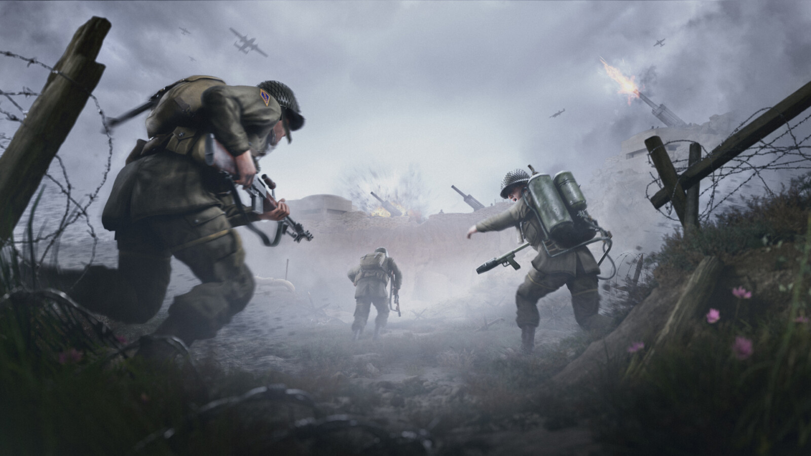
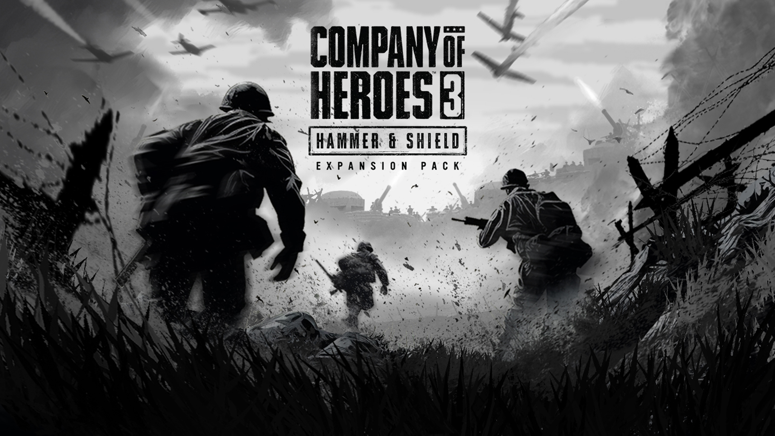
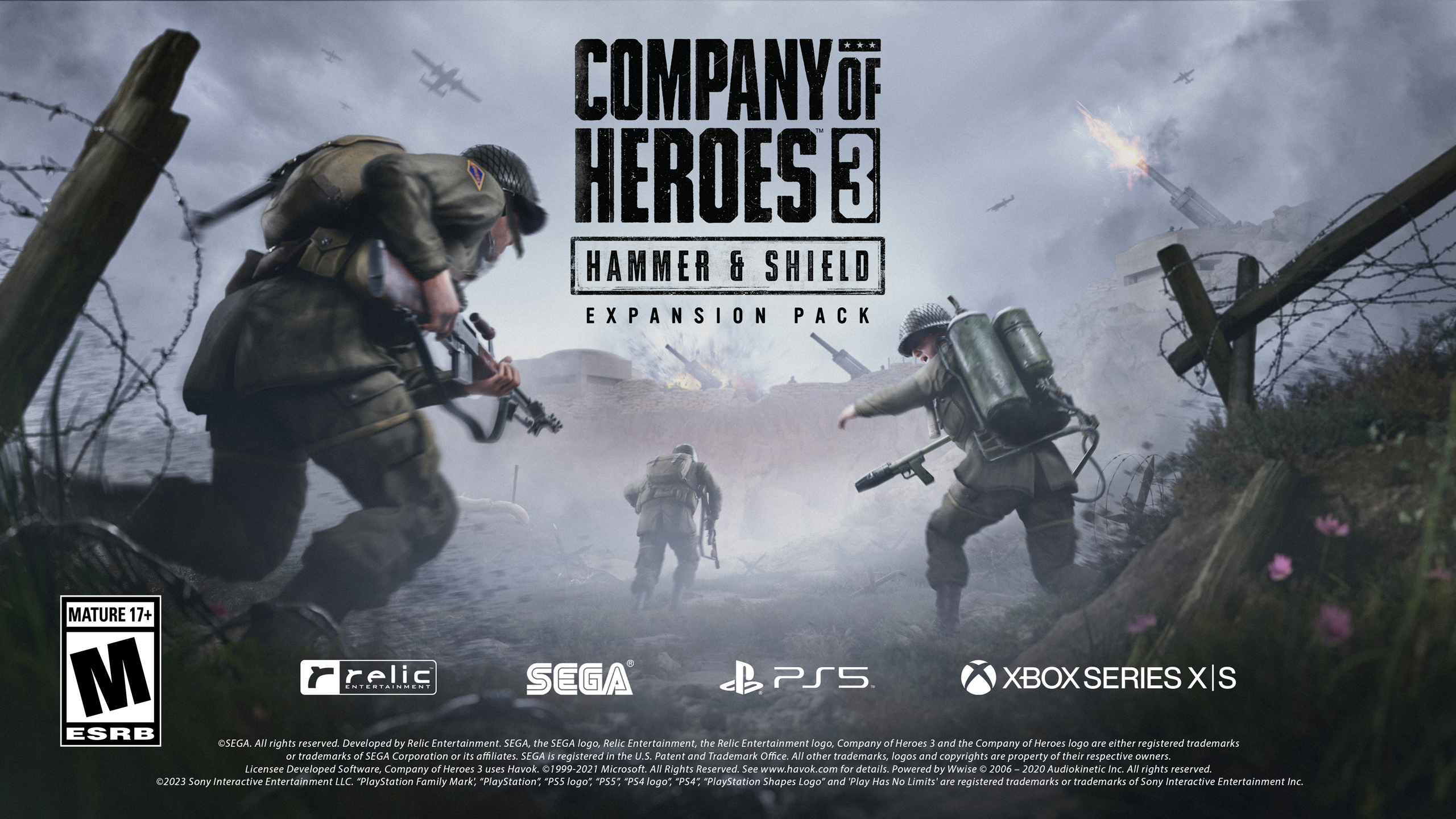
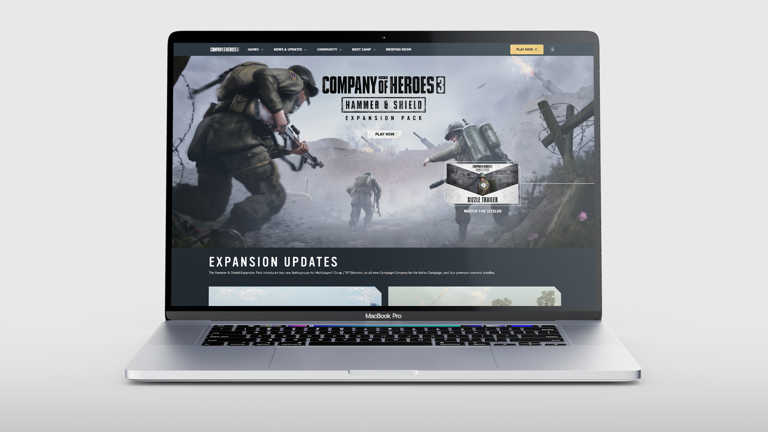
Hammer + Shield Expansion Key Art
The main objective of this key art was to highlight the new battle groups introduced in the expansion, presenting a story with a gritty and cinematic atmosphere. The project involved devising a visual solution to serve as the foundation for the final key art, drawing inspiration from WWII photography and cinematic depictions of war. The primary challenges included meeting tight deadlines while authentically showcasing both factions in a single scene. The work also encompassed the creation of the logo and adaptations for various platforms. Final art was produced by Fluid Studios.
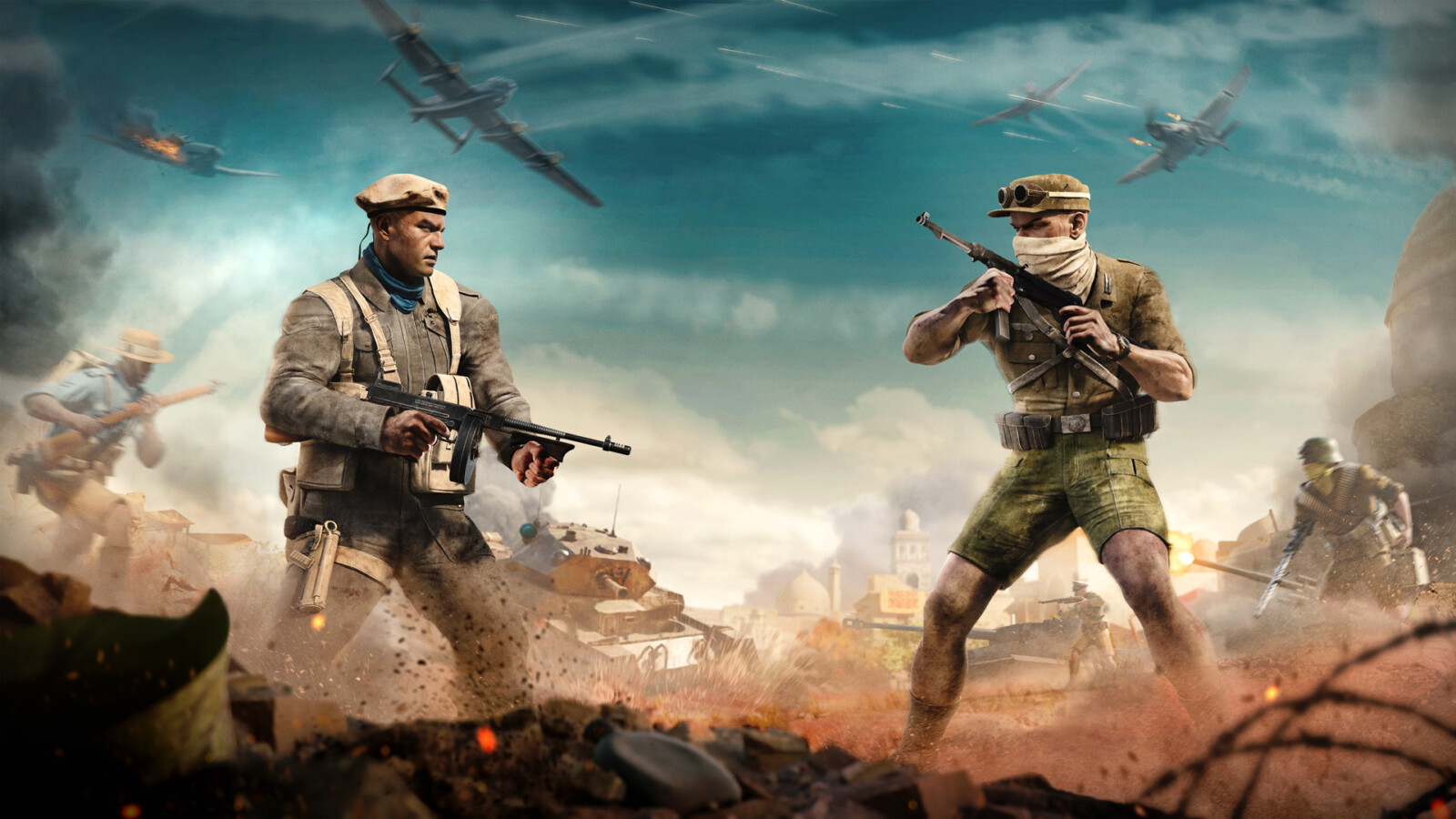
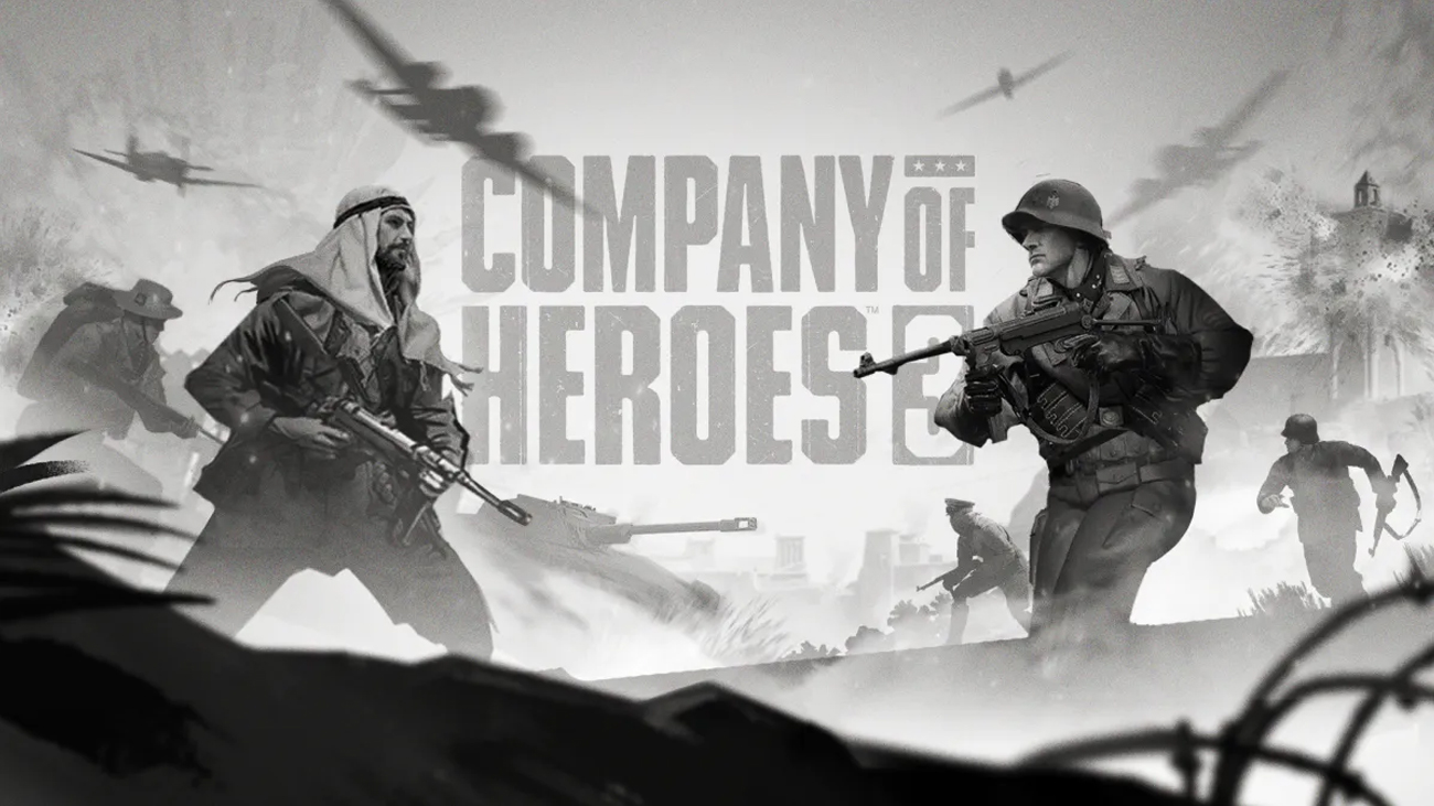
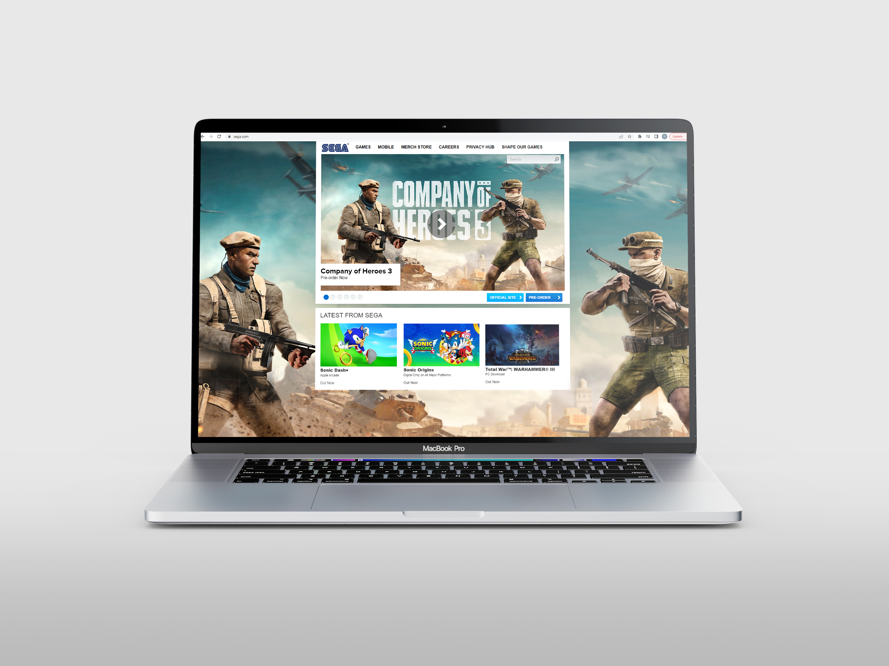
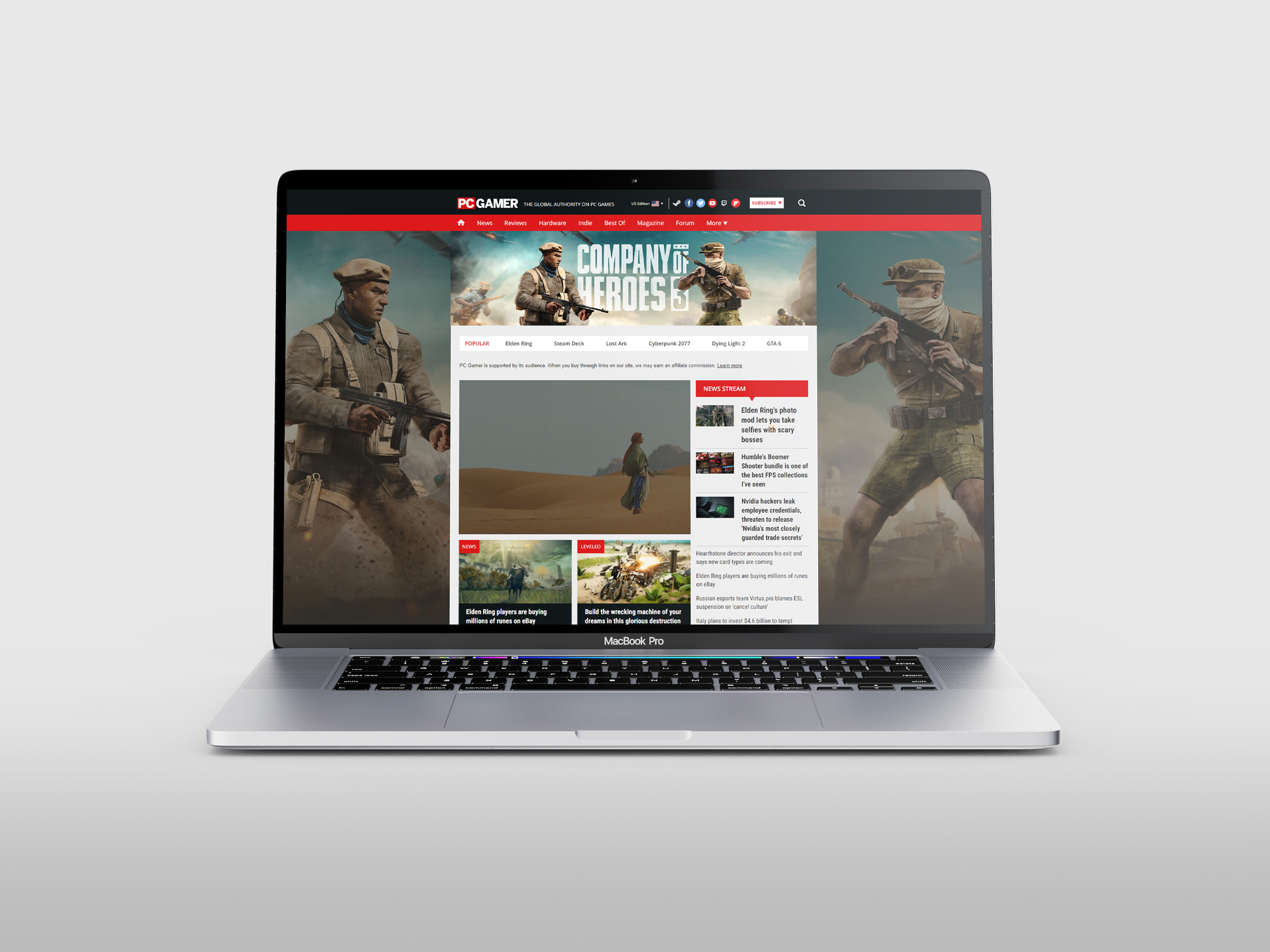
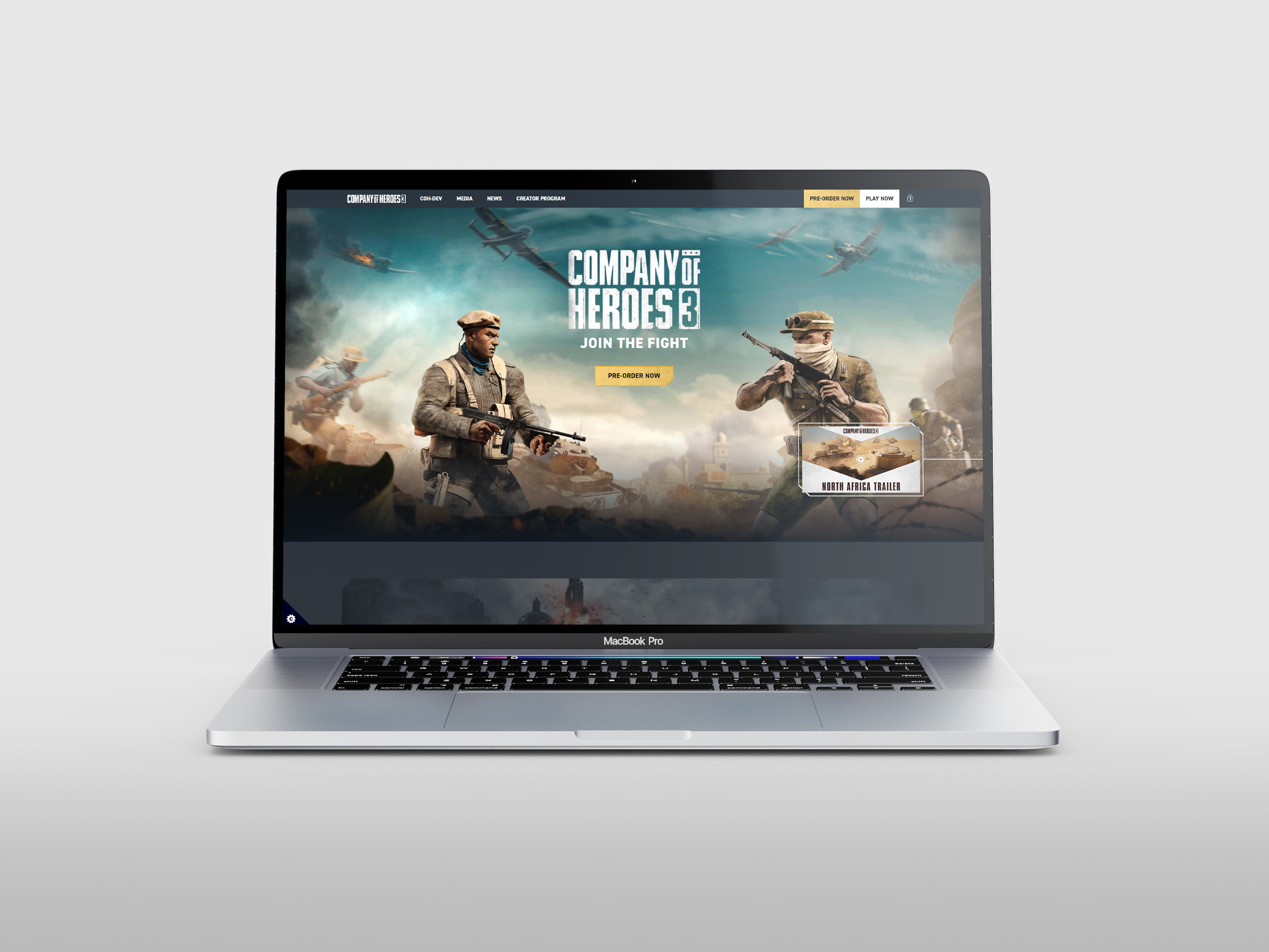
North Africa Key Art
The creation of the key art for the announcement of the new theater and playable faction presented a particular challenge. The objective was to showcase the new playable Deutsches Afrikakorps without centralizing them or positioning them as heroes. After exploring several concepts, a final approach was chosen that addressed the challenge effectively. A composition was created to showcase two opposing fronts while maintaining balance and historical accuracy. In addition to creating the final concept, art direction was provided throughout the project to guide the production artists and ensure the final design met the intended vision. Paired with a vibrant color palette to emphasize the North African theater, the artwork became an eye-catching and exciting addition to the brand materials. Final art was produced by Petrol.
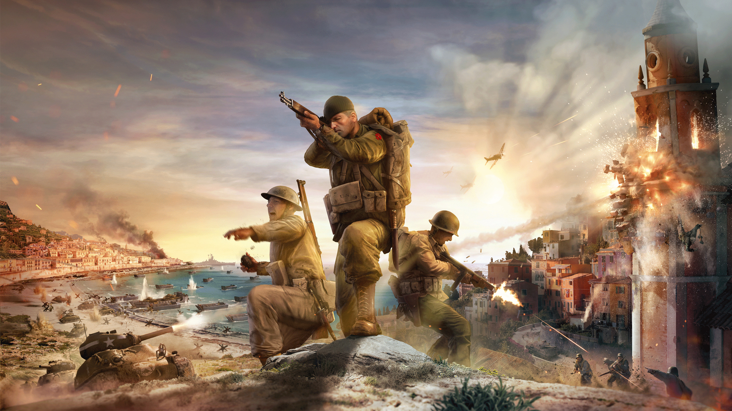
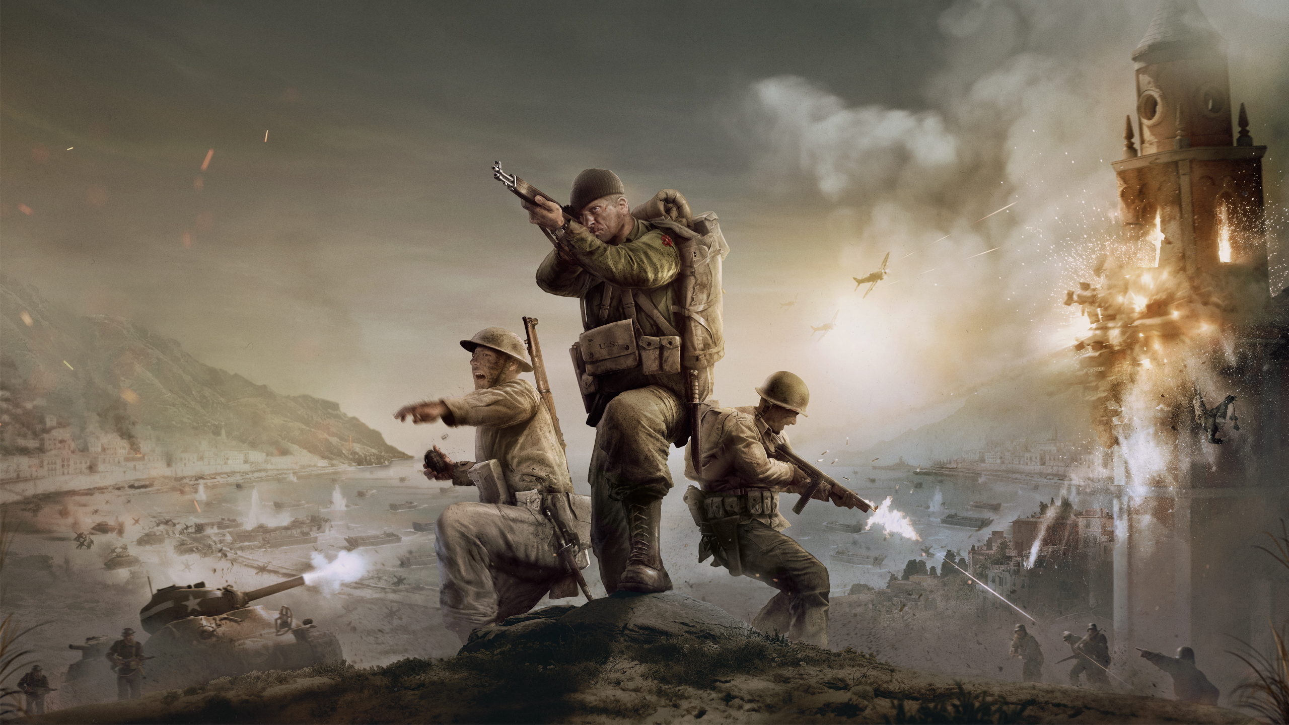
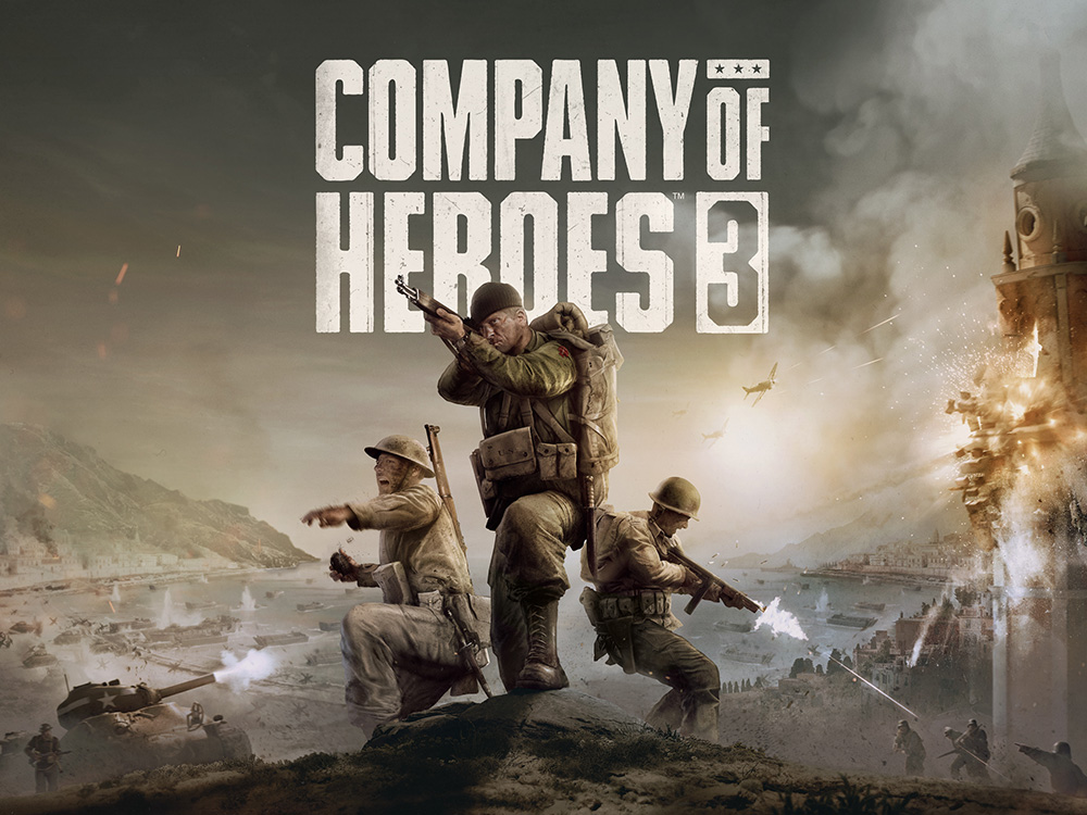
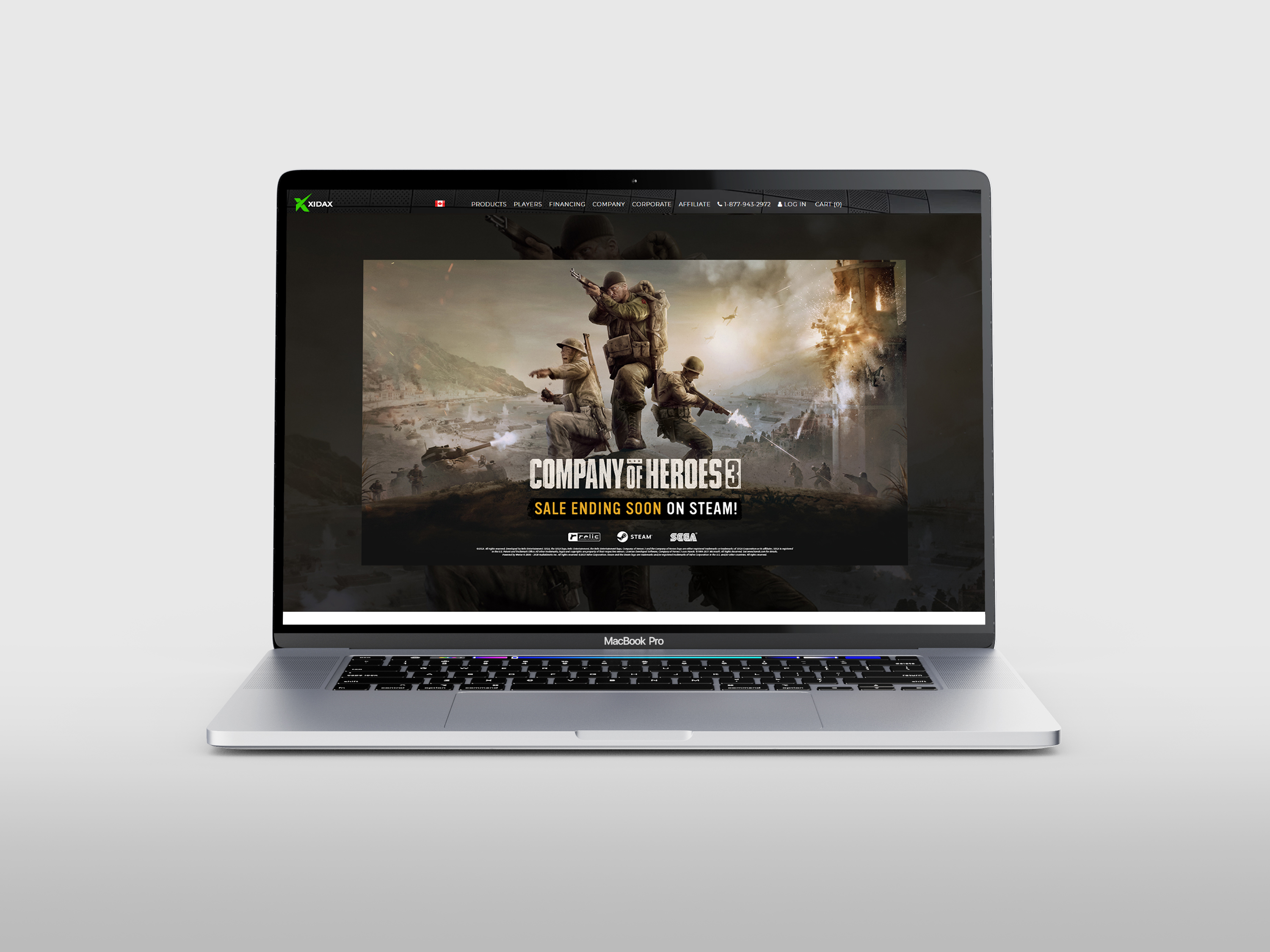
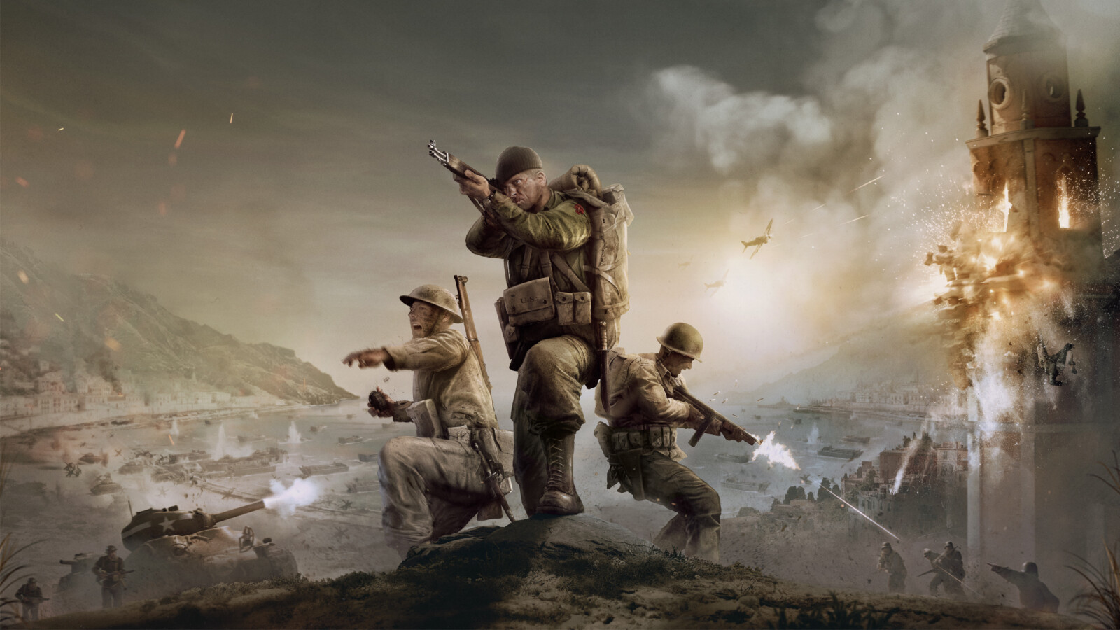
Italy Key Art Refresh
An updated take on the original artwork to align with a new visual direction.
As the one-year anniversary of the release approached, the game’s art direction underwent a transformation, shifting from a vivid palette to a darker, grungier aesthetic. The project involved revising an older key art piece, reworking its elements through compositing, editing, and recoloring to align with the new direction. The scope also included the creation of a supplementary black-and-white Anniversary artwork, crafted as an homage to the franchise’s legacy key pieces and evoking a darker, grittier mood. Together, these artworks played a pivotal role in communicating the game’s updates and reinforcing community confidence in its future direction.